
How to Communicate Asset Risk Without Overreliance on Heat Maps

Heat maps have become the default visual for communicating asset risk. They appear simple. They appear objective. They appear to give leaders a clear picture of where to focus attention. The problem is that heat maps often distort the very information they are meant to clarify. They compress complex risk into a grid of colors that hides uncertainty, masks subjectivity, and creates a false sense of precision.
Heat maps based on risk matrices are no more than two-dimensional graphs. Graphs are merely simple ways to communicate data. The two-dimensional graph became common in the late 1700s in math and social sciences (related to geography and locating features of populations, like diseases). In social science contexts, grey was the color of choice to show areas of higher concentration in the early days. In the 1970s, color printers became more economical and the “heat map” was born. The heat map is used in a number of professions including engineering and meteorology (yes, to hate a “heat map” is to hate a modern weather map).
To hate a “heat map” is to hate a modern weather map.
Senior management needs a clear understanding of asset risk. They need to know where the organization is vulnerable, what the consequences could be, and what choices are available. Heat maps derived from a risk matrix are merely a starting point. Their usefulness as decision tools is simply for initial prioritization. Effectively communicating asset risk requires a more disciplined approach.
The Illusion of Precision
Heat maps derived from risk matrices give the impression that risk can be reduced to a single score. The scoring process commonly involves subjective judgments about likelihood and consequence. These judgments are influenced by experience, assumptions, and organizational culture.
The purpose of a two-dimensional graph, including a risk matrix. Graphs help us to explain data. That makes risk matrices good potential tools on the back-end to communicate findings and insights. They are a useful tool on the front-end to help brainstorm, develop common understanding, and provide insights. Do not mess up the nature of a risk matrix by attempting to make it something that it is not. The risk matrix is simply one tool in the risk toolbox.

The reality is that many risk scores are built on limited data. Asset condition assessments may be incomplete. Failure histories may be inconsistent. Consequence estimates may be based on outdated assumptions. When these uncertainties are hidden behind a color, leaders are not getting the full picture. They are getting a simplified version that may not support sound decisions.
The Problem of False Equivalence
Heat maps also create false equivalence. Two assets may appear in the same red box even though their risks are fundamentally different. One may have a high likelihood of failure with moderate consequences. The other may have a low likelihood of failure with severe consequences. The heat map treats them as equal. Senior management may assume they require the same level of attention or investment.
The risk matrix is not enough on its own. Good, maybe, if your organization is just starting its risk journey. Or helpful for building some common understanding. Or maybe good as part of a communication program. But risk matrices do not have sufficient power for anything other than the simplest problems.

This false equivalence can lead to misallocation of resources. It can also lead to confusion when technical professionals try to explain why two red boxes do not represent the same level of urgency. The visual simplicity becomes a barrier to understanding rather than a tool for clarity.
Establish the Context
Context Matters Most
Context is arguably the most important step in any risk or reliability assessment because it determines what questions are being asked, what information is relevant, and how the results will be used.

Without context, technically sound analyses can lead to poor decisions because they answer the wrong question.
In fact, both ISO 31000 (Risk Management) and ISO 55000 (Asset Management) specify ”establishing the context” at the beginning of their processes. The reason is simple: risk does not exist in isolation. Risk depends on objectives, stakeholders, operating conditions, constraints, and the consequences that matter to the organization.
Example: Purpose of Condition Assessment

Organizations perform asset condition assessments for many reasons, and those reasons should influence the scope, rigor, and frequency of the assessment. An organization may be evaluating a potential acquisition, establishing replacement asset value, developing a predictive maintenance program, or prioritizing capital investments may require very different data than an organization seeking only a general understanding of asset health.
That’s why grabbing a condition assessment score of ‘4’ and coloring it red on a heat map does not tell the entire story. In fact, it may be downright misleading, depending on the context and related approach of the condition assessment.
Systems Thinking
Reliability best practices begin at the system level by identifying the organization's objectives, critical services, and the assets that are most important to achieving them. This context guides which assets should receive the greatest attention during condition assessments and how the results should be interpreted. Ultimately, the value of a condition assessment is measured not by the condition of individual assets, but by how well it improves decisions about system reliability, risk, and investment.
What Leaders Actually Need
Senior management needs a clear understanding of the nature of the risk. They need to know what could happen, how likely it is, and what the consequences would be. They also need to understand the uncertainty in the analysis. They want to know where the data is strong and where it is weak.
A heat map cannot provide this level of insight. It can highlight areas of concern, but it cannot explain them. Business leaders need a narrative that connects the technical assessment to the operational and financial realities of the organization. A structure is needed that helps decision makers understand their choices when it comes to asset risk.
Better Ways to Communicate Asset Risk
One part of communicating asset risk effectively requires moving beyond the heat map. Scenario comparisons provide a clearer picture of how different failures would affect the organization. Risk curves show how risk changes over time and how interventions shift the trajectory. Options and impacts tables help leaders understand the consequences of different investment choices.

Are you performing a risk analysis or an uncertainty analysis?
Another aspect is to make risk understandable to everyone. Most professionals do not understand the difference between risk and uncertainty. And while everyone has a definition of risk, few people have the same definition. Operationalize risk, even if the common understanding is not as theoretically correct as you prefer.
A Formal Communication Approach Supports Better Decisions
Heat maps are not the problem. Overreliance on them and poorly communicating them are the problem. They are useful for insights, initial prioritization, and a communication tool when used properly. Heat maps need a communication approach that respects the complexity of asset risk while presenting it in a way that supports action.
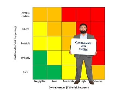
The elements of the FINESSE fishbone diagram® are Frame, Illustrate, Noise reduction, Empathy, Structure, Synergy, and Ethics.
An example of communication to senior management is provided in the referenced article.
Communicating Asset Risk Beyond Heat Maps
We usually help business leaders make better decisions when we move beyond the heat map. With that said, heat maps based on a risk matrix are not the problem. Heat maps are just one tool in the risk toolbox and can be used effectively. The keys for understanding asset risk when using them is to apply the techniques correctly, not over-rely on them, and to use a formal communication approach.
Solomon, J. D. (2026, July 15). How to communicate asset risk without overreliance on heat maps. Communicating with FINESSE. https://communicatingwithfinesse.substack.com/p/how-to-communicate-asset-risk-without
JD Solomon is the founder of JD Solomon, Inc., the creator of the FINESSE Fishbone Diagram®, and the co-creator of the SOAP criticality method©. He is the author of Communicating Reliability, Risk & Resiliency to Decision Makers: How to Get Your Boss’s Boss to Understand and Facilitating with FINESSE: A Guide to Successful Business Solutions.


Comments