top of page
A new category for AI sites, but traditional sites are still the go-to in 2026.

Hurricane season is upon us in the US Southeast. Once again, you’ll need the best sources of information to tell you when it’s time to batten down the hatches or get ready to be on the move. This year, I’ve added a new category on AI forecasting models, along with updated notes on emergency flood models, seasonal forecasting, and ocean temperature trends. These are my Top 6 sources for predicting and tracking hurricanes in 2026.


#1 NOAA National Hurricane Center (NHC)

Still the most authoritative source for real-time data, forecasts, and advisories. New for 2026: smaller, more accurate forecast cones and an experimental cone that shows the true range of track uncertainty. A must-have on any list.


#2 Tropical Tidbits

Levi Cowan continues offering excellent insights, making this site a favorite among weather enthusiasts and professionals.


#3 Mike’s Weather Page (Spaghetti Models)

This page remains a valuable resource, especially with its aggregation of multiple models and easy-to-digest updates.


#4 Track the Tropics

The site is a comprehensive resource with quick access to various models and data.


#5 Weather Underground

Although it has undergone some changes over the years, it remains a strong source of localized weather data.


#6 The Eyewall

The Eyewall – Seeing you through the storm


Emergency Response

North Carolina has a great publicly available site called FIMAN (Flood Inundation Mapping and Alert Network) for travel needs. FIMAN displays current and forecasted water levels from hundreds of locations throughout North Carolina’s streams and coasts, helping residents and travelers make informed decisions during flood events.


Some Southeast U.S. states, including state departments of transportation (DOTs) and emergency management systems, have developed similar tools in recent years. If you are traveling after a major weather event, find your local sites.


Seasonal Forecasting

WeatherTiger

WeatherTiger is boldly reimagining seasonal forecasting and agricultural meteorology through the use of proprietary technologies. It's on Substack and subscription-based. I use it more as a reference and for weather insights than for real-time tracking.


Tropical Storm Risk (TSR)

Tropical Storm Risk (TSR) offers a leading resource for predicting and mapping tropical storm activity worldwide. TSR has won two major insurance industry awards: the British Insurance Awards for Risk Management (2006) and London Market Innovation (2004). Useful early in the season or before storms form; less useful when a storm is active and you need immediate decisions.


AI Forecasting

Google DeepMind – Weather Lab

Weather Lab is Google DeepMind’s free, public site for exploring AI-generated cyclone forecasts from its WeatherNext models alongside the official NHC track. It's new to my list this year and it's become a legitimate complement to the traditional model guidance above – worth bookmarking, not a replacement for the NHC.


Ocean Temperature Trends

University of Miami – Rosenstiel School of Marine, Atmospheric, and Earth Science

The overarching focus of the Rosenstiel School’s Upper Ocean Dynamics Laboratory (UODL) is to develop, implement, and disseminate academic research on the coupling between the oceanic and atmospheric boundary layers under both weak and strong wind conditions.


University of Maine – Climate Change Institute

Climate Reanalyzer began in early 2012 as a platform for visualizing climate and weather forecast models. Site content is organized into three general categories: Weather Forecasts, Climate Charts, and Research Tools.


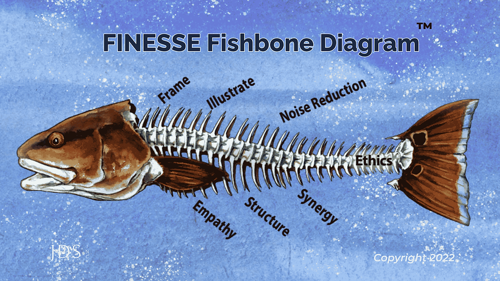
JD Solomon resides in the Carolinas, where he fishes, sails, and coaches baseball. Professionally, JD Solomon is the founder of JD Solomon, Inc., the creator of the FINESSE fishbone diagram®, and the co-creator of the SOAP criticality method©. JD has weathered many storms, both on land and at sea.


Tornado diagrams are one of xix esstential visuals for reports and presentations.

Budgeting decisions have a regular rhythm. So do long-term capital planning efforts, at least for those organizations that do them. The normal picture is a staff member walking into the boardroom with a list of capital needs, some type of priority list, and a stack of printed spreadsheets. The board or council usually listens politely and asks an occasional question about the biggest line items. However, the question that everyone wants to understand is: what are the key variables that are driving the budget decision and which assumptions about those variables have the most variability?


A tornado diagram answers it in one picture, if you can get it in front of the room.


The Time I Didn’t Get to Show a Tornado Diagram

I landed in Tennessee around 11 am. Our project manager, Jerry, picked me up. The game plan was to meet our regional manager, Ron, for lunch and then go directly to the client’s office. There we would work with their senior management team to evaluate and prioritize a new compliance-driven capital program.


Jerry waited until we got to Chili’s with Ron to spring his concern on me. “JD, I am having a major problem with that one slide. I don’t understand it. And it's kept me awake most of the night.”


We were on the same team, so I tried to make light of it by saying, “Jerry, there’s no reason to lose sleep over a slide. Let’s talk about it.”


“You know I am an engineer,” he said stoically. “And while I appreciate you sending me the slides a week ago, I didn’t look at them until this past weekend. I just need to understand everything before I let you present something to my client.”


“You’re kidding me,” I thought as I glanced toward Ron. But his eyes told me this wasn’t going away.


As a subject matter expert who was used to dropping in out of the air to solve problems, I knew three things about this situation. First, the reason I was there was because I was an expert (not the project manager), but many project managers trained as engineers never take off their engineering hat. Second, I knew I had to go into supportive mode just as I would with the client. And third, it was Jerry’s client, so it was his call.


So I pulled out my laptop, opened Excel, and shifted my seat to be beside Jerry. I had to try but I knew I was doomed to fail.


After about ten minutes, Jerry said what we all knew he would say, “I just can’t understand this until I can actually focus on the details. Let’s pull this slide.”


“I am good with that,” I stated. “I have another way to cover this. But have you already sent the slides to the client?”


“No, just the agenda and the meeting objective. I don’t like to send the meat of the presentation in advance,” he stated.


“Oh, shit,” I thought. “We have bigger problems than a tornado diagram.”


Sensitivity analysis was just a small part of the meeting, and overall the meeting went ok. The reason I remember this story so well is that I was back in front of them two months later. This time I was explaining a tornado diagram. The executive management team understood it almost immediately; I am not sure that engineer Jerry ever did.


What a Tornado Diagram Actually Shows

The tornado diagram takes its name from its shape; in practice, things at the top matter more than things at the bottom.

A tornado diagram is a modified bar chart built to communicate the results of a sensitivity analysis, run either deterministically or probabilistically. It gets its name from its shape: the input variables with the most influence on the output sit at the top with the widest bars, and the inputs with the least influence taper down toward the bottom. That narrowing of the bars makes it like the funnel of a storm.


It’s a good fit for decisions related to understanding which variables have the most influence on the solution, prioritizing rehabilitation projects, sizing a reserve fund, ranking which assets get the next round of capital, and establishing multi-year budgets. The shape of the diagram does something a table of numbers can’t. At a glance, the tornado diagram shows which variables are actually worth arguing about and which ones are noise.


…the tornado diagram shows which variables are actually worth arguing about and which ones are noise.


The Explanation Sequence That Works in the Boardroom

Decision makers do not need a statistics lecture. They need a sequence, delivered once, in this order:


  1. The input variables are listed down the left side of the diagram.

  2. The vertical line running through the center of the bars represents the central tendency — usually the median result.

  3. Each bar shows the range of variation in that central result caused by uncertainty in that one input.

  4. Therefore, the inputs at the top of the diagram matter far more to the decision than the inputs at the bottom.


This four-point sequence works almost every time. You can then turn the presentation into an interactive conversation, if the management team or decision makers choose to.


The tornado diagram becomes a standing reference for the rest of the project or program. And once you use it, the management team will request it for their next big decision.


A Built-In Bonus: It’s Also a Quality Check

Here’s a detail that rarely makes it into the slide deck but is worth knowing before you sign off on the analysis: a tornado diagram doubles as its own quality-assurance check.


A tornado diagram doubles as its own quality-assurance check.


Every bar in a tornado diagram should touch the vertical centerline (baseline). If one doesn’t, that input’s variation isn’t actually reaching the output. There is a flaw in the underlying model that the modeler has not detected.


My team and I have caught real errors this way in analyses handed over by other consultants, simply by checking whether every bar crossed the centerline before it ever reached a decision maker.


The tornado diagram earns its keep twice: once as a communication tool for the room, and once as a review tool for whoever is responsible for standing behind the numbers.


Presenting It Well

A few habits that are worth building in.


  1. Lead with the picture, not the labels

The input list along the left edge doesn’t need to be legible the first time the diagram goes up; only the shape does. Legibility matters later, when you drill into a specific input.


  1. Keep the color palette disciplined

Shades of black and blue for the bulk of the bars, sharper colors like green and red reserved for the one or two points you actually want remembered.


  1. Trust the executives

Technical staff often want to dive into the math faster than the audience is ready for; decision makers usually get to “the top matters more than the bottom” before their own advisors expect them to. After all, most executives want to know what time it is and not how the clock is made.


Why Tornado Diagrams Belong in Your Toolkit

Capital planning, risk-informed decision making, and budget prioritization all run on the same underlying question: which assumptions are worth management time, and which ones aren’t? It really gets to the central ideas of sensitivity, criticality, and priorities. A tornado diagram answers those ideas in one visual. It tends to become a visual that's requested again and again once it’s on the table.


This piece draws on material from JD Solomon’s book Communicating Reliability, Risk, and Resiliency to Decision Makers, along with tornado-diagram guidance previously published on Communicating with FINESSE.


Need help getting started? JD Solomon Inc provides solutions for program development, asset management, and facilitation at the nexus of facilities, infrastructure, and the environment.

Author's preface: I often get asked about how environmental rulemaking works in North Carolina. This article is a bit off the beaten p[ath but hopefully you will find it informative and somewhat interesting.

Complying with the rules and making the rules are two different things.

State environmental commissions are one of the most misunderstood structures in state government. They are not ceremonial boards or public-comment sessions with a fancier name. And they are not advisory panels that meet a few times a year to bless whatever staff has already decided.


In practice, environmental commissions function much like rules committees. They are the same kind of body that governs decision making in legislatures, professional associations, and major competitions. Their purpose is simple. Internal staff should not set all the policy and direction behind the rules. Commissions provide the external balance and cross-user perspective that good rulemaking requires.


What Rules Committees Actually Do

Rules committees exist to create structure and fairness. That holds whether you are talking about sports, competitions, or professional associations. Most serve two related functions. They establish how decisions get made and they put a buffer between the staff who administer a program and the rules that govern everyone under it. Some go further and build in public transparency and formal appeal rights as well.


In legislative bodies, rules committees determine how bills move. In competitions, they set eligibility, scoring, and appeals. Commissions play the same role in environmental governance. They set the rules of the game so regulated entities, citizens, and agency staff all operate under a clear, predictable structure.


Without a rules committee, the people who administer a program also write the rules for it. That is rarely a good idea.


Why Environmental Agencies Need One

Environmental regulation is a classic case of high stakes, high complexity, and high conflict. Air quality, water resources, waste management, and land development all involve competing interests and technical detail.


Agencies implement federal programs, manage permits, enforce violations, and respond to emergencies. With that much operational responsibility, it is easy for internal staff to drift toward setting policy through administrative action rather than deliberate rulemaking.


Environmental commissions prevent that drift.


North Carolina, Alabama, California, and Texas built commissions on this premise. Commissions ensure that rulemaking is not driven solely by internal priorities, staff interpretations, or day-to-day operations. They bring structure to the process, forcing rule changes to be vetted publicly, openly debated, and adopted through a transparent, multi-member body.


Built for Cross-User Representation

Rules committees work because they bring multiple viewpoints to the table. Environmental commissions do the same.


Depending on the state, commission seats are set aside for industry, conservation groups, engineering and science professions, legal or public-interest backgrounds, and the general public. North Carolina's statute goes further still, reserving seats for a physician, an agricultural representative, a hydrologist, a biologist, and someone familiar with local government, among others.


Cross-user representation is about balance. Rules need to be technically sound, economically reasonable, and publicly defensible. Commissions provide that balance in a way an internal staff structure simply cannot.


This sets up a pattern that shows up across rule-making bodies well outside environmental governance. The people who enforce the rules are rarely the dominant voice at the table. Environmental commissions follow the same logic.


The Pattern Shows Up Everywhere

Look at how rules committees work in other fields, and the pattern holds.


Major League Baseball's Competition Committee has eleven members. Six are team owners, four are players, and one is an umpire. The umpire, the person who actually enforces the rules on the field, is a minority voice. The committee is built around those who compete under the rules, not those who officiate them.


College football works the same way. The NCAA's Football Rules Committee is built mostly from head coaches and conference administrators, the people who coach and compete under the rules every Saturday. On-field officials are not part of it. Oversight of officiating runs through a separate national office.


The National Speech & Debate Association runs on a similar model. Its Competition and Rules Leadership Committee has at least seventeen members, and by rule at least three-quarters must be active coaches from member schools. Judges are not part of the equation at all. The people who prepare students to compete, through their coaches, hold the seats, not the officials who run tournament rounds.


Technical standards bodies follow the same principle, and this one will feel familiar to engineers. NFPA, the organization behind widely used fire and life-safety codes, caps every technical committee at one-third membership from any single interest category, whether that is manufacturers, insurers, or the enforcing authorities who apply the codes. No single interest, including the regulators, gets to dominate the committee that writes them.


Environmental commissions follow the same logic. Agency staff, the referees of environmental regulation, are present but not dominant. The structure ensures that the people who must comply with the rules have a meaningful voice in shaping them.


The Problem This Solves

The core problem is straightforward. Internal staff should not set all the policy and direction behind the rules.


Staff expertise is essential. Staff judgment is valuable. But staff perspective is inherently shaped by the agency's operational responsibilities, internal culture, and regulatory pressure. Without a commission, rulemaking can become an extension of agency operations rather than a structured, balanced process.


Environmental commissions solve this by functioning exactly like rules committees. They bring oversight, structure, and cross-user representation that keeps rulemaking balanced and defensible. They remain one of the most important governance tools for making sure environmental rules serve everyone, not just the agency that administers them.


The Rules Are Being Kept Fair

Rules committees exist so the referees do not also write the rulebook. State environmental commissions are no different. The next time a commission meeting looks slow or overly procedural, remember what is actually happening in the room. The rules are being kept fair.


JD Solomon is currently in his third term as the chair of the North Carolina Environmental Management Commission (EMC). The fifteen-member EMC is the state's environmental rulemaking body.


Experts
bottom of page