top of page
Search


How to Use Structure to Communicate with the FINESSE Fishbone Diagram
Without Structure, your Frame collapses, your Illustrations lose impact, and your Empathy never reaches the audience.

JD Solomon
Jan 26


How Project Managers Can Be Brief and Know Their Message Is Clear
My rule of thumb is that 1200 words correlate to 10 minutes of speaking time.

JD Solomon
Jan 22


Why Checking Accessibility for PowerPoint Headings is Good for All High-Stakes Presentations
Making Microsoft PowerPoint headings more accessible makes your slides more effective for the entire audience.

JD Solomon
Sep 8, 2025


Beware of Microsoft Word and PowerPoint for Checking Color and Contrast
Microsoft Word and PowerPoint’s built-in color and contrast checker doesn’t always perform well, especially when it comes to backgrounds involving images or gradients.

JD Solomon
Sep 3, 2025


Why Your Visuals Need More Than Canva for Accessibility and Alt Text
Canva makes these shortcomings worse by setting up the case of "flexibility that supports creativity" versus "structure that supports accessibility.”

JD Solomon
Aug 14, 2025


Is Your PowerPoint Presentation Ready for the Colorblind?
The things you do to make your presentation and reports more accessible to people with impairments make your work more understandable to all

JD Solomon
Mar 17, 2025


The Power of Using a Well-Timed Pause in Big Presentations
A well-timed pause isn’t a break in your speech—it’s part of your message.

JD Solomon
Feb 24, 2025


Are You Focused on the Three Act Structure in Your Big Presentations?
Focus first on the opening. Focus next on the closing. The blind spot is that they spend too much time on time on the main body.

JD Solomon
Feb 17, 2025


Why Ask Simple Questions to Gain Better Insights
Simple questions feel less intimidating, making people more likely to respond truthfully.

JD Solomon
Feb 3, 2025


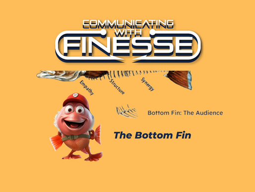
The Bottom Fin of the FINESSE Fishbone Diagram
The Fins of FINESSE provide some helpful associations. The bottom fin of FINESSE, the audience, provides us with our balance.

JD Solomon
Jan 22, 2025


How the FINESSE Fishbone Diagram Helps Technical Professionals and Project Managers
Career growth depends on using proven communication approaches in addition to hard skills.

JD Solomon
Jan 20, 2025


From Wildfires to Hurricanes: Three Indicators of a Rare Event
Rare events can usually be identified within the seven categories of crisis.

JD Solomon
Jan 13, 2025


Why Grammarly is Essential for Effective Writing & Communication
Online editing tools such as Grammarly are invaluable for clear and effective communication.

JD Solomon
Dec 23, 2024


Remember the Alt Text for Tables in Word and PowerPoint
Alt text for tables is a small step that can have a big impact.

JD Solomon
Dec 2, 2024


Three Sleeper Fonts that Create Powerful Presentations
Roboto, Raleway, and Avenir are three less common fonts that can create powerful presentations that overcome accessibility issues.

JD Solomon
Nov 18, 2024


Use the Strategic Plan When Communicating Big Business Presentations
Typical Strategic Goals in a corporate strategic plan usually relate to five to eight focus areas.

JD Solomon
Oct 21, 2024


Have Backup
Make sure all of the backup firepower is present. Management and the lead presenter share an essential role in making it happen.

JD Solomon
Oct 14, 2024


Communicate “To," Not “At” Someone for Better Results
Screaming for help and directing someone to call 911 is the difference between talking at versus talking to someone.

JD Solomon
Sep 30, 2024


Keep Your Summaries to 300 Words for Success
The average person can speak between 125 and 200 words per minute.

JD Solomon
Sep 23, 2024


Use “DraftFinal” Until the Accessibility Checks Are Done
Using a “DraftFinal” file extension is one way to make sure the accessibility checks are done.

JD Solomon
Sep 16, 2024
Experts
bottom of page
